Note
Go to the end to download the full example code
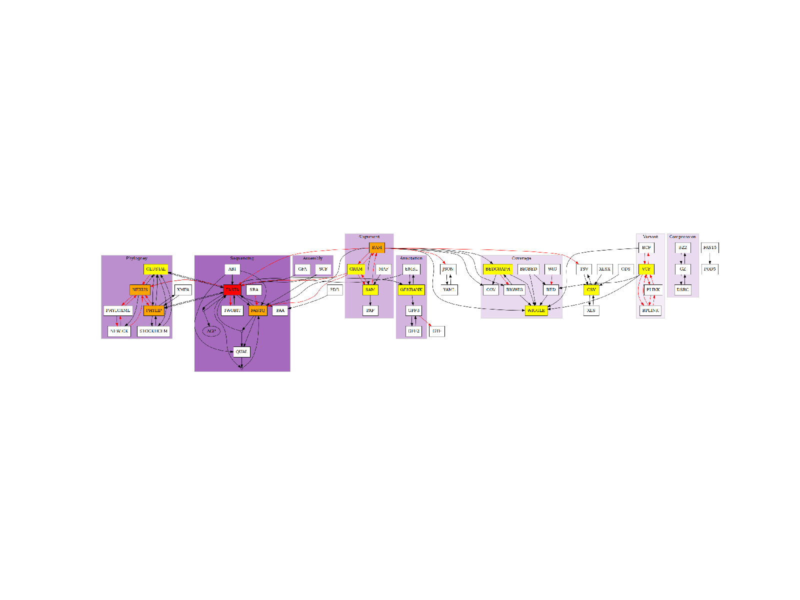
6.3. Possible Conversion (clustered)
Plot directed graph of possible conversions clustered by field
from bioconvert.core.graph import create_graph
If you use pygraphviz, you can have a good quality image using:
import matplotlib as mpl

mpl.rcParams["figure.dpi"] = 250
In order to create the following image, you need graphviz and pygraphviz. If you cannot install those packages, you may use a singularity image like in the following example by setting the use_singularity parameter to True. This would work under Linux. Not tested on other systems yet.
try:
    create_graph("conversion.png", use_singularity=False, include_subgraph=True)
except:
    create_graph("conversion.png", use_singularity=True, include_subgraph=True)
from pylab import imshow, imread, xticks, yticks, gca

imshow(imread("conversion.png"), interpolation="nearest")
xticks([])
yticks([])
ax = gca()
ax.axis("off")
(-0.5, 2879.5, 651.5, -0.5)
Total running time of the script: ( 0 minutes 0.424 seconds)