Note
Go to the end to download the full example code
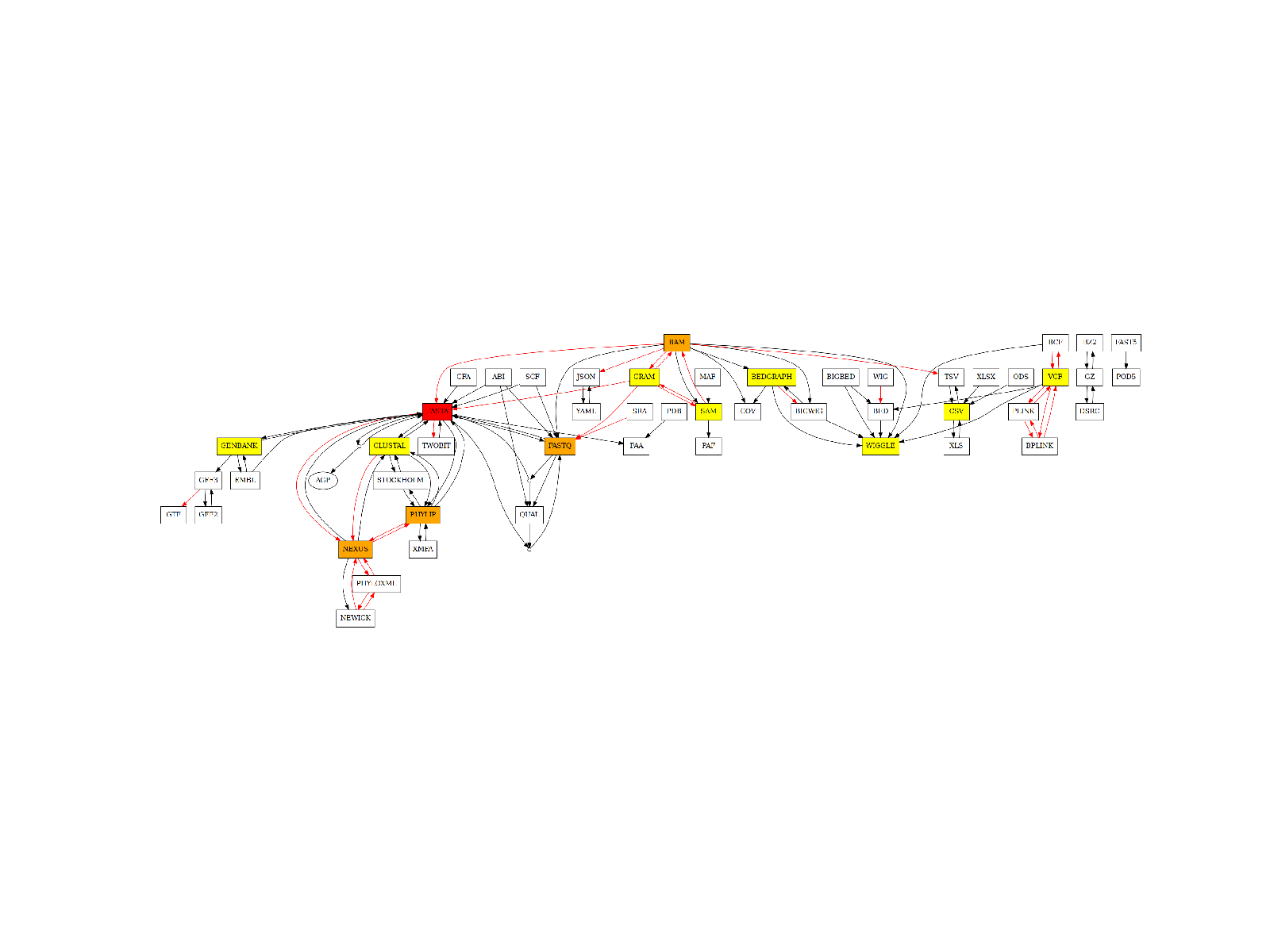
6.1. Possible Conversion (annotated)
Plot directed graph of possible conversions with annotation (color indicated degree of each format)
from bioconvert.core.graph import create_graph
If you use pygraphviz, you can have a good quality image using:
import matplotlib as mpl

mpl.rcParams["figure.dpi"] = 250
In order to create the following image, you need graphviz and pygraphviz. If you cannot install those packages, you may use a singularity image like in the following example by setting the use_singularity parameter to True. This would work under Linux. Not tested on other systems yet.
try:
    create_graph("conversion.png", use_singularity=False)
except:
    create_graph("conversion.png", use_singularity=True)
from pylab import imshow, imread, xticks, yticks, gca

imshow(imread("conversion.png"), interpolation="nearest")
xticks([])
yticks([])
ax = gca()
ax.axis("off")
(-0.5, 2746.5, 826.5, -0.5)
Total running time of the script: ( 0 minutes 0.700 seconds)